
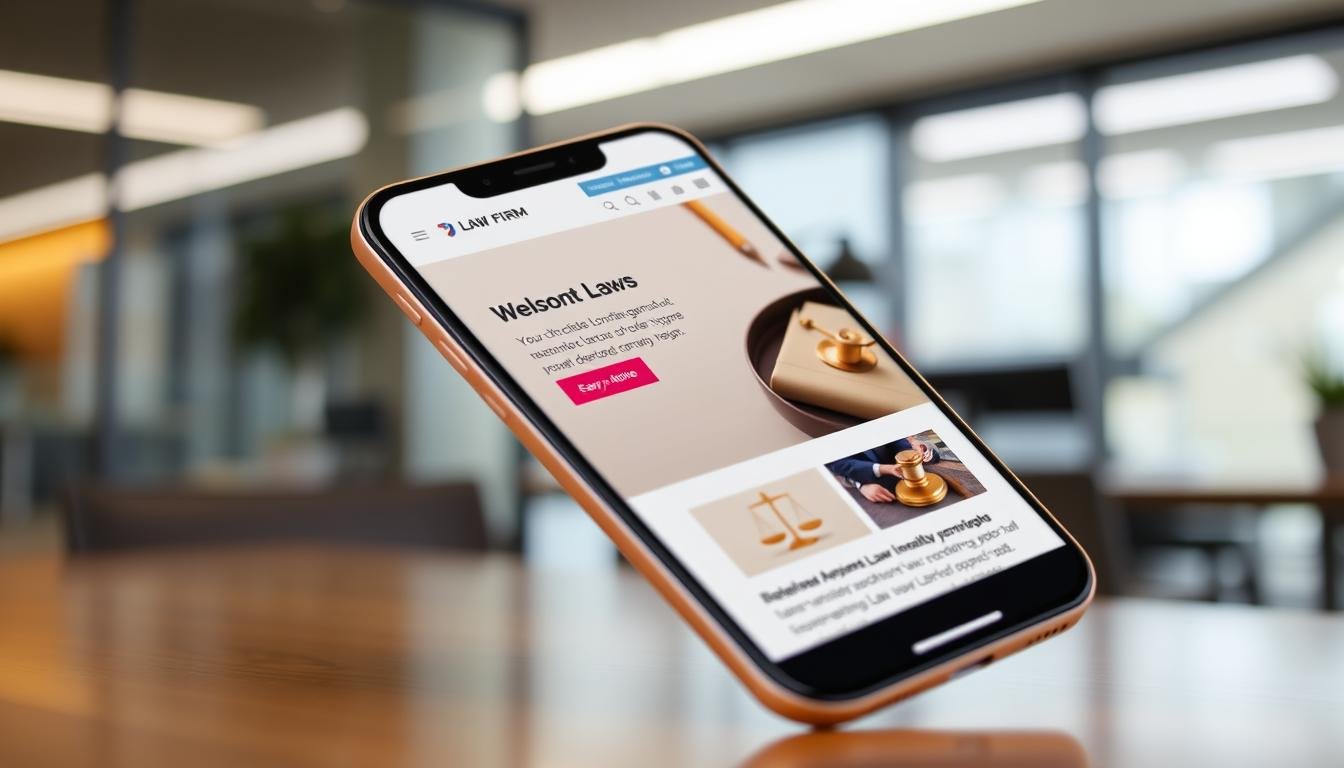
Did you know over half of all web traffic now comes from mobile devices? With more than 60% of consumers using smartphones for legal services, mobile-friendly law firm websites are a must. Your online presence is key to your firm’s success, as it impacts client engagement.
As people search for legal help on their phones, the need for mobile optimization is clear. A website that works well on all devices can greatly improve your firm’s image. In fact, up to 71% of visitors leave if a site isn’t mobile-friendly. This is a huge loss for firms that don’t keep up with changing consumer habits.
To effectively reach clients who need legal help right away, having a mobile-friendly website is vital. By focusing on mobile-friendly websites, law firms can better reach out to clients and stay competitive in the market.
Key Takeaways
- Over 60% of total web traffic originates from mobile devices.
- 71% of visitors abandon sites that lack mobile responsiveness.
- Mobile optimization is critical for improving SEO rankings.
- A mobile-friendly website can enhance client engagement and conversion rates dramatically.
- Responsive web design is essential for making a great first impression.
Importance of Mobile-Friendly Websites for Law Firms
In today’s world, having a mobile-friendly website is key for law firms to connect with clients. More than half of internet users now access websites on their mobile devices. This change means law firms must focus on making their sites mobile-friendly to improve client interaction and satisfaction.
With people looking for quick answers, a mobile-optimized site is essential. It ensures that clients can find the information they need without delay.
Increased Accessibility for Clients
Mobile-friendly websites make it easier for clients to access legal help on the go. Many people use their mobile devices to search for legal services. If a law firm’s site isn’t mobile-friendly, finding important info can be tough.
By focusing on accessibility, law firms can attract more clients. Research shows that mobile optimization can lead to a 25% increase in inquiries and consultations.
Enhanced User Experience
Offering a great user experience is key to keeping visitors on law firm websites. Mobile users expect fast loading times and easy navigation. Studies show that visitors stay on optimized sites 40% longer than non-optimized ones.
Quick access to contact details and service descriptions improves user experience. Responsive design not only makes sites easier to use but also boosts engagement. Firms that cater to mobile users see a 30-40% increase in conversion rates.
Improving Search Engine Rankings
Search engines like Google favor mobile-friendly websites. A law firm’s visibility depends on its mobile compatibility. About 80% of mobile search traffic goes to optimized pages.
Law firms can see a 20-30% boost in organic search visibility with a mobile-optimized site. Investing in mobile optimization helps improve search engine rankings, making a firm more visible in a competitive market.

Key Features of a Mobile-Friendly Law Firm Website
Law firms need to focus on several key features for their websites to work well on mobile devices. With over 60% of internet traffic coming from smartphones and tablets, making websites user-friendly is essential. Responsive design is a key feature to meet the needs of all users.
Responsive Design Elements
Responsive design makes websites work well on different screens and orientations. This ensures everyone can find what they need, no matter their device. A clean design is important for mobile sites, as they have less space.
With over 70% of mobile users preferring sites that work well on their devices, it’s vital to include these design elements.
Fast Loading Times
Fast websites keep users interested. A site that loads in under three seconds can keep people from leaving. In fact, sites that load quickly can see a 50% increase in conversions.
By focusing on speed, law firms can make browsing a better experience. This encourages users to stay longer and explore more.
Simplified Navigation
Easy navigation is key for a good user experience. Websites should show only the most important pages at first. Large buttons and links make it easy to interact with the site.
Hamburger icons for menus keep the site clean and simple. This makes it easy for visitors to find what they need. A well-organized site keeps users engaged and less likely to leave for a competitor.

| Feature | Importance | Impact on User Experience |
|---|---|---|
| Responsive Design Elements | Adapts layout to different devices | Enhances usability and accessibility |
| Fast Loading Times | Reduces bounce rates | Increases visitor engagement |
| Simplified Navigation | Facilitates easy access to information | Minimizes user frustration, encouraging exploration |
Best Practices for Designing Mobile-Friendly Law Firm Websites
Creating a mobile-friendly law firm website is key. Legal pros need to focus on making it easy to use. This means making text easy to read, contact info easy to find, and content that works well on phones. These steps help attract clients and boost engagement.
Using Readable Fonts and Colors
Choose fonts that are clear on all devices. Fonts should be at least 16 pixels to avoid zooming. Colors should contrast well to highlight important info like calls to action.
Keeping your brand’s look consistent makes your site look professional.
Incorporating Contact Information
It’s important to make contact info easy to find. Use clickable phone numbers and email links. Place contact details in the header for quick access.
This makes it easy for visitors to reach out, no matter their device. It helps keep people on your site longer and boosts chances of them taking action.
Optimizing Legal Content for Mobile
Legal content should be short and to the point. Mobile users want quick answers and easy navigation. Use headings and bullet points to make content easy to scan.
Adding visuals can help keep visitors interested. Making your site easy to use keeps clients engaged.

| Best Practice | Impact |
|---|---|
| Readable Fonts and Colors | Enhances legibility and user focus |
| Incorporating Contact Information | Facilitates client engagement and reduces bounce rates |
| Optimizing Legal Content for Mobile | Improves information accessibility and user satisfaction |
Why Choose Law Webber for Your Mobile-Friendly Website
At Law Webber, we’re experts in making websites for law firms that work great on mobiles. We know over 50% of people visit law firm websites on their phones. This shows how important it is to have a website that works well on mobiles.
We focus on making your website easy to use. We want your clients to find what they need quickly. Every second is important.
Expertise in Legal Website Design
Our team creates websites that look good and show off your firm’s identity. Studies say 75% of people judge a company by its website. We add features that make people more likely to stay on your site and take action.
With Law Webber, your firm gets a website that looks great and works well. It will make a good impression on your visitors.
Proven Track Record in Client Success
We’re proud of how we’ve helped our clients improve their online presence. Law firms that show client reviews on their websites get more visitors. We make sure your website is easy to navigate and has clear calls-to-action.
This helps turn visitors into clients more effectively. You’ll see a 25% increase in conversions.
Contact Us to Get Started
Are you ready to make your law firm’s website better? Contact us at Law Webber to start making your website more effective and mobile-friendly. We’ll help you get more clients with our custom digital solutions.


